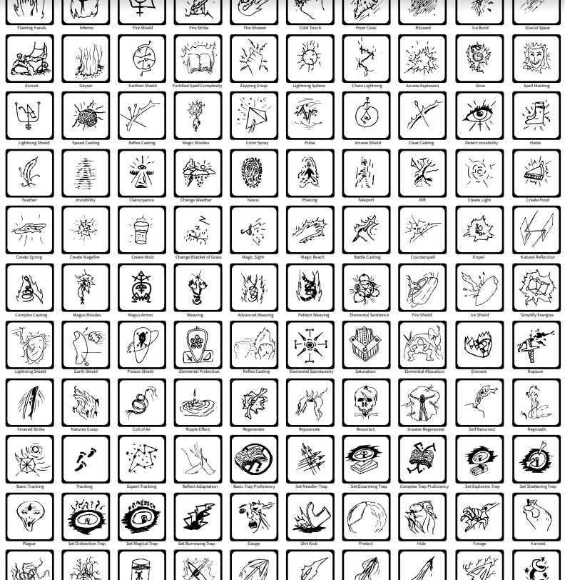
Ability Icon User Experience
There are 4 basic requirements when creating ability icons. Nathaniel Inman discusses what these are and some tangent points.

When using abilities within most games the user doesn't have any time to look for an ability name so recalling an ability quickly by an image or icon that accurately represents it is incredibly beneficial. Similar to this idea, there are 4 basic requirements when creating ability icons. Below they are listed in priority order.
- It must be easily used (click/button press, etc.)
- The user shouldn't have to look around documentation to understand what button to press
- The user shouldn't have to struggle to hold down multiple buttons just to use it
- Accessibility should be taken into account (screen readers, etc.)
- It must be easy to interpret it's purpose
- The user can immediately see the icon and have a meta thought about what it means, and thereby understand the ability that is being represented intuitively.
- It must be identifiably unique to other icons
- Icons shouldn't look exactly alike
- Sometimes its best to have certain icons look similar if they have similar functions, but how similar they look should not cause confusion
- It must not be too distracting
- The icon should be convenient to the user, not distracting from the gameplay.
- The icon must be appropriately sized
- The icon must be carefully colored
- The icon must have an appropriate amount of contrast